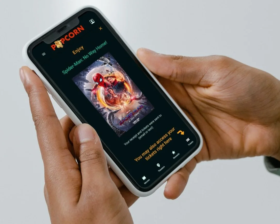
Popcorn mobile ticketing app
Overview
Case study for the POPCORN mobile ticketing app for movie theatres.
As the sole UX designer, I led the end-to-end design process for the POPCORN mobile ticketing app, from conception to delivery. Here is an overview of my responsibilities and the steps involved in creating a seamless user experience:
1. Research:
Conducted primary and secondary research to gain insights into user needs, preferences, and pain points related to movie ticket booking.
Performed a competitive audit to understand the existing market landscape and identify opportunities for differentiation.
2. User Interviews:
Conducted interviews with target users to gather firsthand feedback and understand their expectations and behaviors when it comes to movie ticketing apps.
Incorporated user feedback into the design process to ensure user-centricity.
3. Wireframing:
Developed paper and digital wireframes to create a visual structure and layout for the app's screens and functionalities.
Ensured a logical and intuitive user flow by mapping out the user journey from ticket selection to payment and confirmation.
4. Prototyping:
Created low-fidelity prototypes to test and validate the app's information architecture, interactions, and overall usability.
Gradually refined the prototypes into high-fidelity designs, incorporating visual elements and branding guidelines.
5. Usability Studies:
Conducted usability studies with real users to evaluate the app's effectiveness, efficiency, and user satisfaction.
Gathered feedback on navigation, clarity of information, ease of use, and overall user experience.
6. Accessibility Considerations:
Ensured the app design adhered to accessibility guidelines to accommodate users with disabilities or diverse needs.
Implemented features such as adjustable font sizes, color contrast enhancements, and screen reader compatibility.
7. Iterative Design:
Iterated on the design based on user feedback, usability test results, and stakeholder input.
Fine-tuned interactions, visual elements, and layout to enhance the app's overall user experience.
By incorporating a user-centered design approach and conducting thorough research and testing, the POPCORN mobile ticketing app was optimized to provide a seamless and enjoyable movie ticket booking experience. Throughout the project, I focused on creating an intuitive interface, streamlining the ticketing process, and ensuring accessibility for all users.
Problem Statement
Busy workers and parents struggle to buy movie tickets in advance due to time limitations, hindering their ability to secure desired seats and avoid lengthy queues at the theatre.
Goal: Develop a user-friendly app enabling swift and seamless ticket purchases for movies at the most convenient theatre locations.
Users and Audience
I conducted interviews and created empathy maps to better understand the users I’m designing for and their needs. A primary user group was busy professionals with children who need to buy many tickets in advance.
This user group confirmed assumptions about mobile ticketing apps. Still, research also revealed that buying tickets in advance was not the only factor that influenced this group to purchase tickets online.
Other user frustrations included challenges in locating nearby theatres showing specific movies and encountering registration barriers that hindered quick purchases.
Outcomes and Results
(detailed design process below)
During the design process of the Popcorn app, I realized that my initial ideas were just the starting point.
Conducting usability studies played a vital role as they helped me refine and iterate on my designs, ensuring that the app truly addressed the needs of the users.
“This app is so fun and easy to use, I wish it existed already! Tell me you will sell it, the current apps are rubbish!”
- quote from a user in the usability study
Detailed design process
-

Understanding the user
Creating a persona: problem statement and user journey
Pain points
-

Starting the design
Paper and digital wireframes
Low-fidelity prototype
Usability study Round 1
-

Refining the design
Usability study Round 2
Accessibility considerations
Mockups, Final Mockups
High fidelity prototype
Understanding the user
Creating a persona: Eriko
Problem statement
Eriko is a busy professional mother who needs to buy movie tickets in advance because she wants to guarantee the seats of her family members and avoid lines at the nearest theatre.
User journey map
Eriko’s user journey illustrates how helpful an app to buy movie tickets quickly would be to users.
Pain points
Starting the design
Paper wireframes
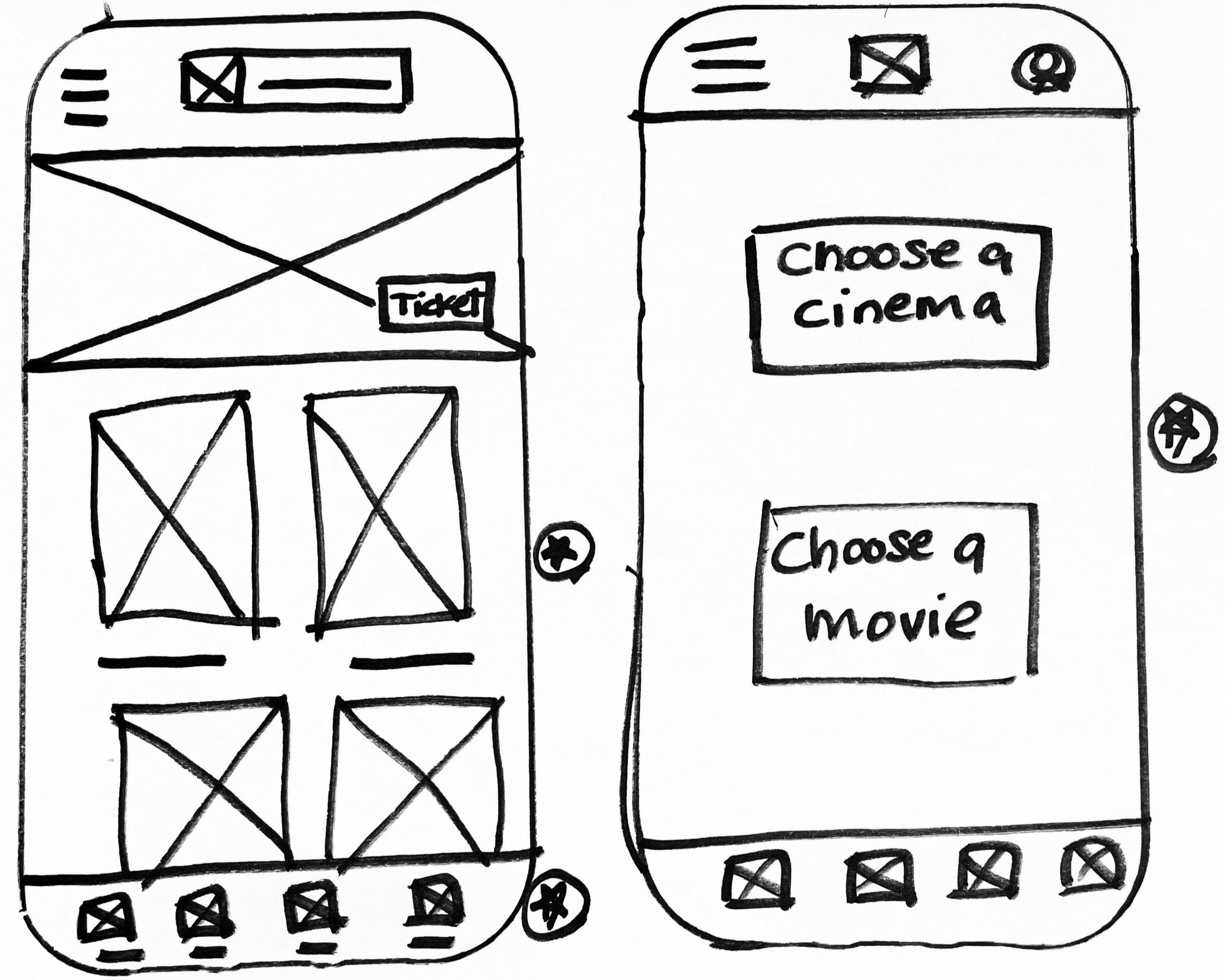
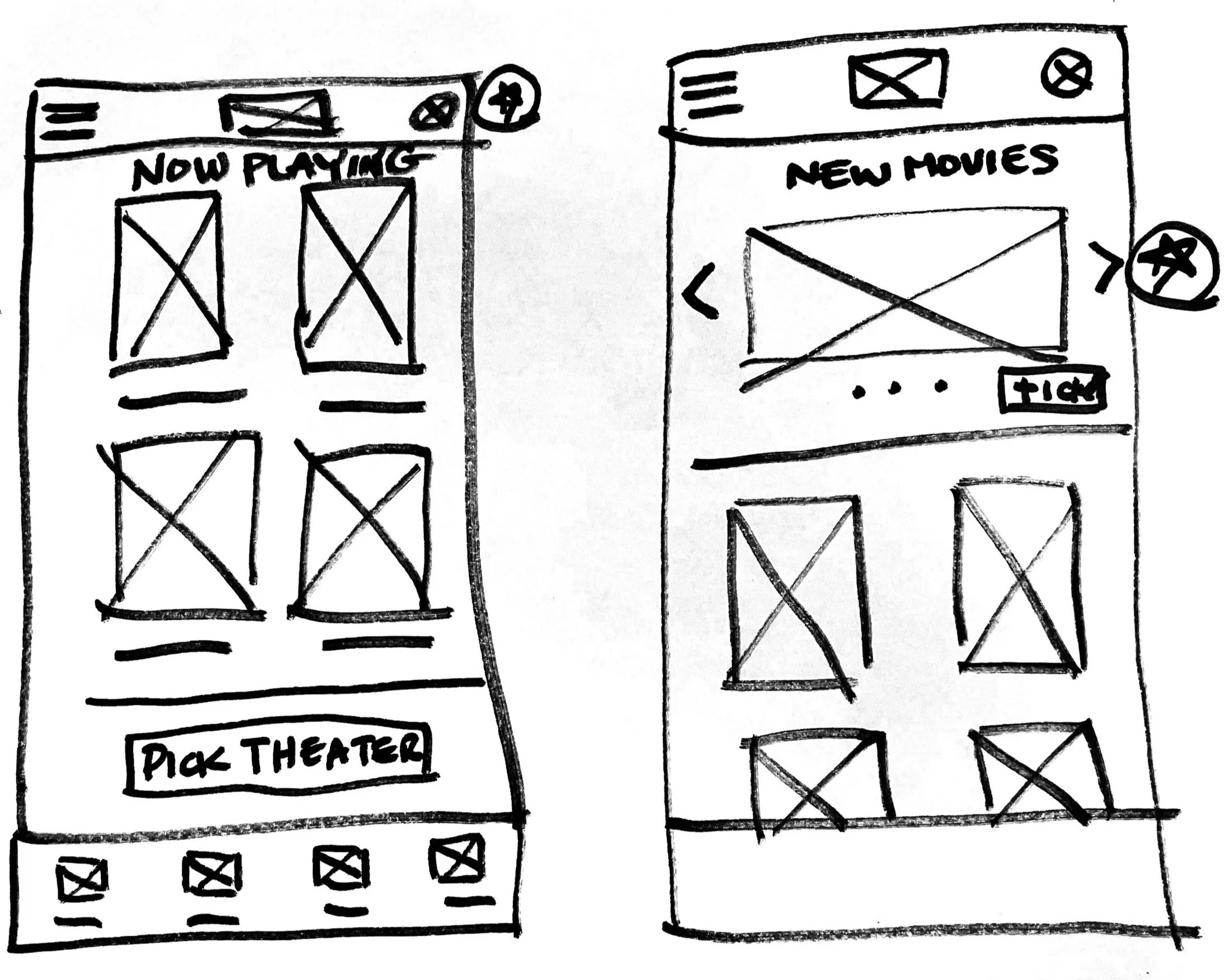
Drafting the iterations of each screen of the app on paper was a quick and easy way to explore options and finalize decisions about the elements addressing user pain points to be included in the digital wireframes.
I identified the best elements from each draft with a star. Those were then combined in one final screen.
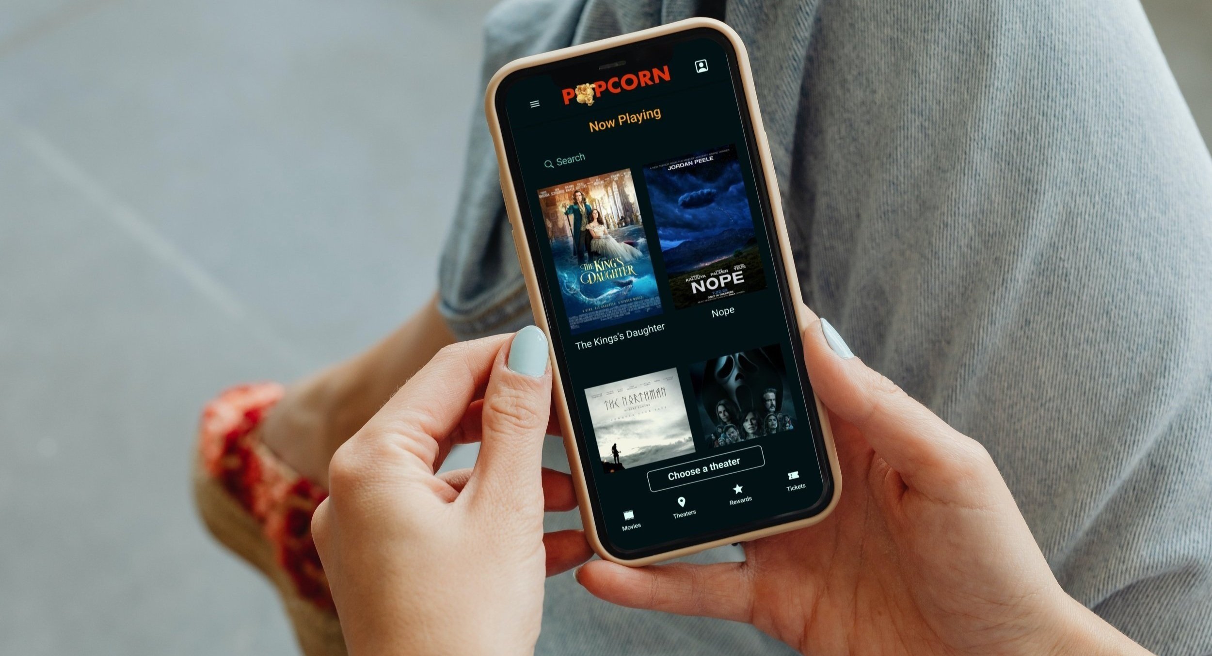
For the home screen, I included a scrolling list of films and a ”choose a theatre” button to make it quick and easy to choose a film.
first drafts of the homepage
final draft of the homepage
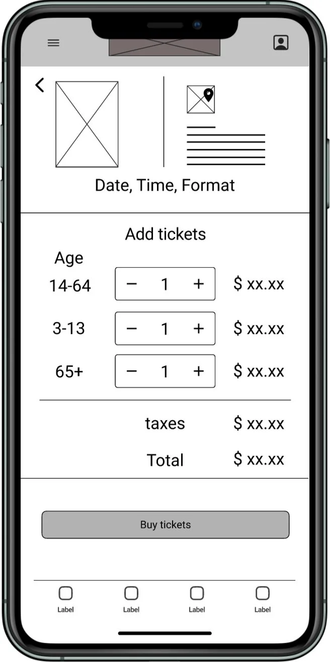
Digital wireframes
As the initial phase continued, I made sure to integrate user research insights into my screen designs.
Users can easily confirm their film with an image (poster), their cinema with a map, and a summary of the screening date, time and format chosen.
Users can easily add tickets and see the price in real-time before confirming their transaction.
Low-fidelity prototype
The low-fidelity prototype connected the primary user flow of scheduling a screening of a movie at a chosen theatre so the prototype could be used in a usability study with users.
View the Popcorn app low-fidelity prototype.
Usability study: Round 1 findings
I conducted two rounds of usability studies. Findings from the first study helped guide the designs from wireframes to mockups:
Users need clear cues to navigate the steps required to purchase movie tickets.
Users want to see some information on the same page to select their theatre (time, format, price, tickets left).
Users need to be able to input their information somewhere in the app to receive their tickets.
Refining the design
Usability study: Round 2 findings
The second study used a high-fidelity prototype and revealed what aspects of the mockups needed refining:
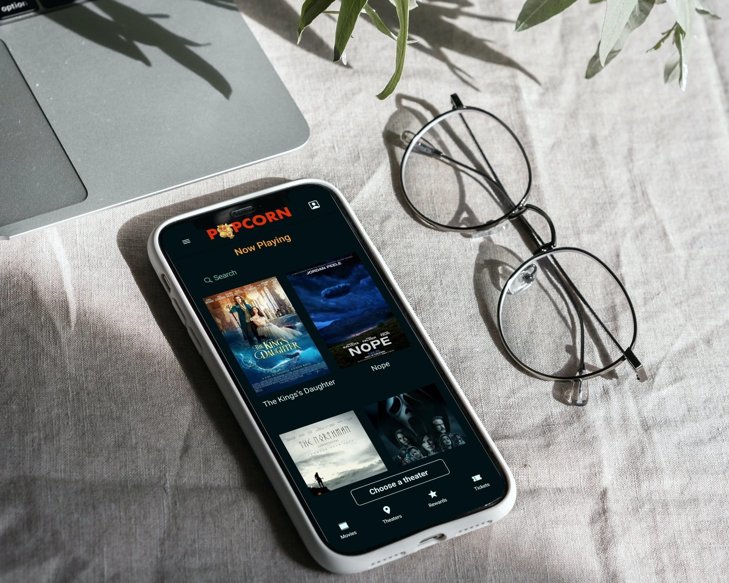
Users need a streamlined homepage with movies sorted alphabetically and a search option.
Users need better cues to know where they are in the app.
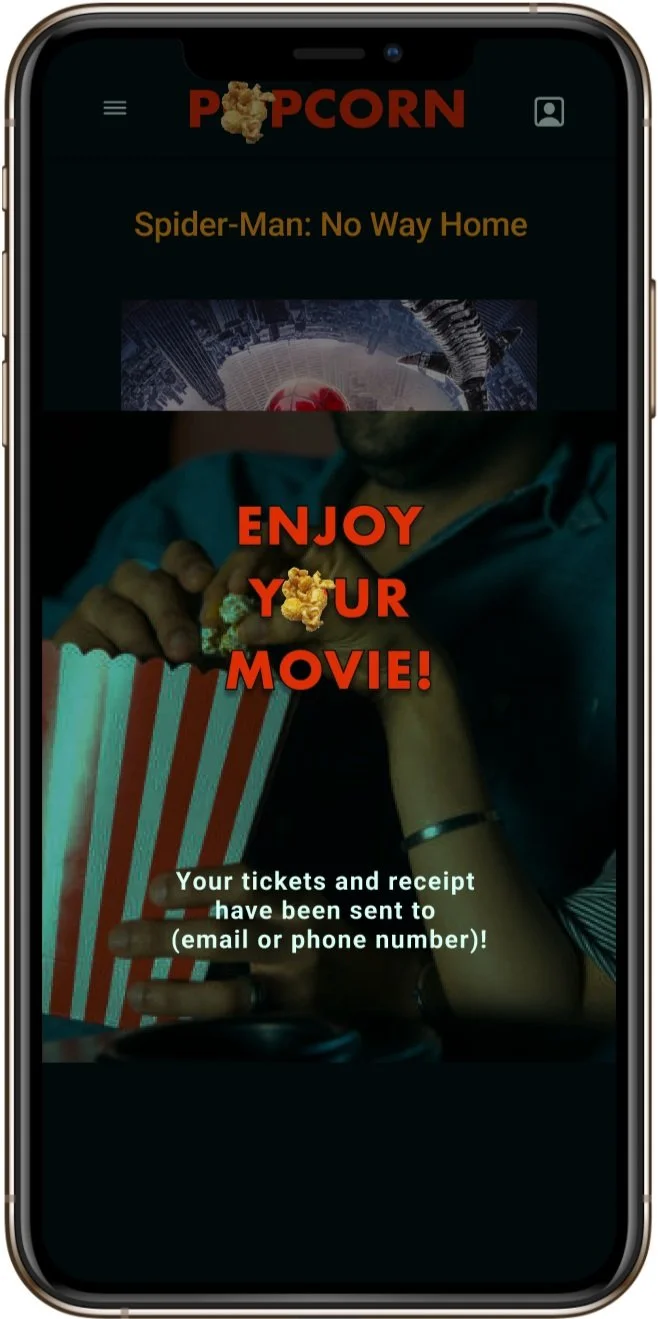
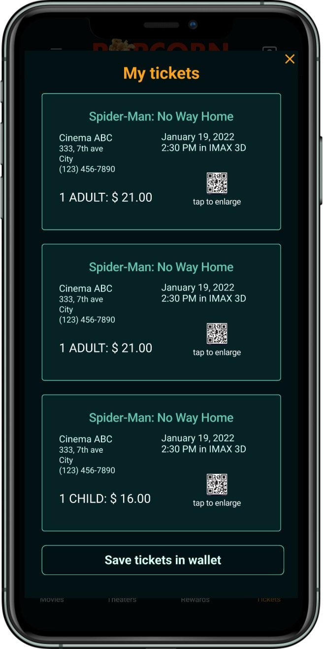
Users need to see their tickets right after purchase and to be able to access them through the app.
High-fidelity prototype
The final high-fidelity prototype presented cleaner user flows for choosing a film, a date, a theatre and a time and checking out. It also met users’ needs to easily navigate within the app and access their tickets from within the app.
View the Popcorn app Figma high-fidelity prototype
Mockups
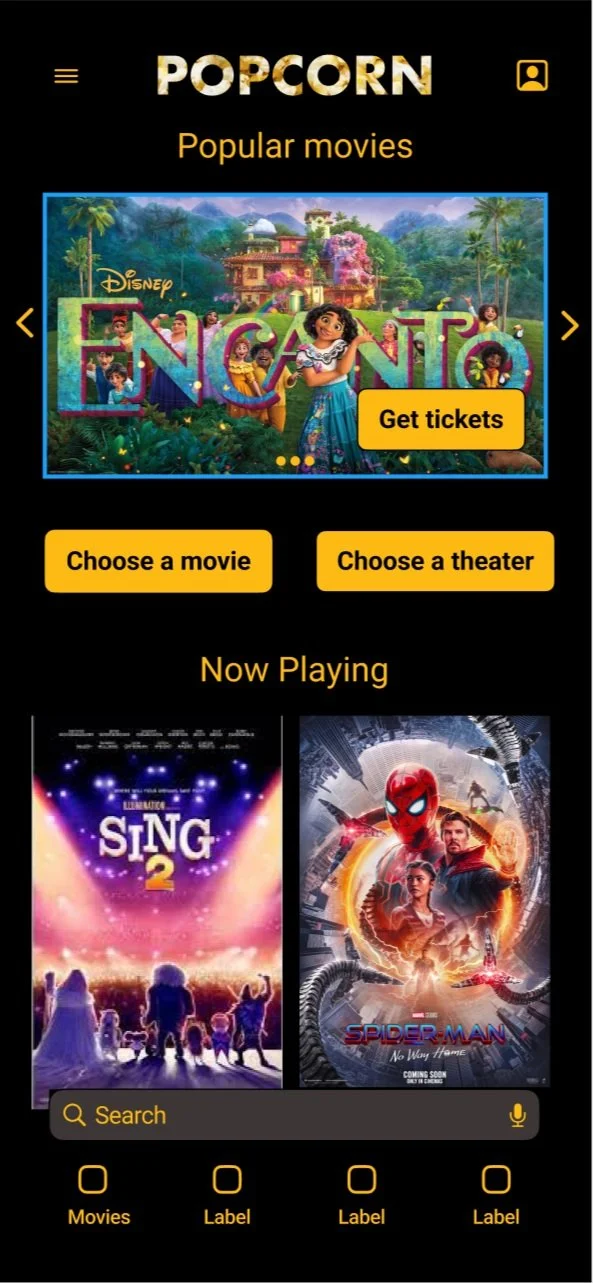
Early designs included a banner for popular movies at the top of the homepage, multiple buttons, and a scrollable movie list.
After the second usability study, I opted to remove the top banner in favour of more screen space for movies and an option to tap a button if the user prefers to first choose their theatre instead of a film.
before usability study
after usability study
The study revealing the need for users to be reassured that they had their tickets by seeing them instantly on the confirmation of transaction page, I added a ticket sub-menu in the bottom menu bar that opens a page where tickets with QR codes are readily accessible from within the app.
before usability study
after usability study
Final mockups
Accessibility considerations
Used icons to help make navigation easier.
Used detailed imagery for movies and maps to theatre locations to help all users better understand the designs.
Provided access to users who are visually impaired by adding alt text to images for screen readers.
