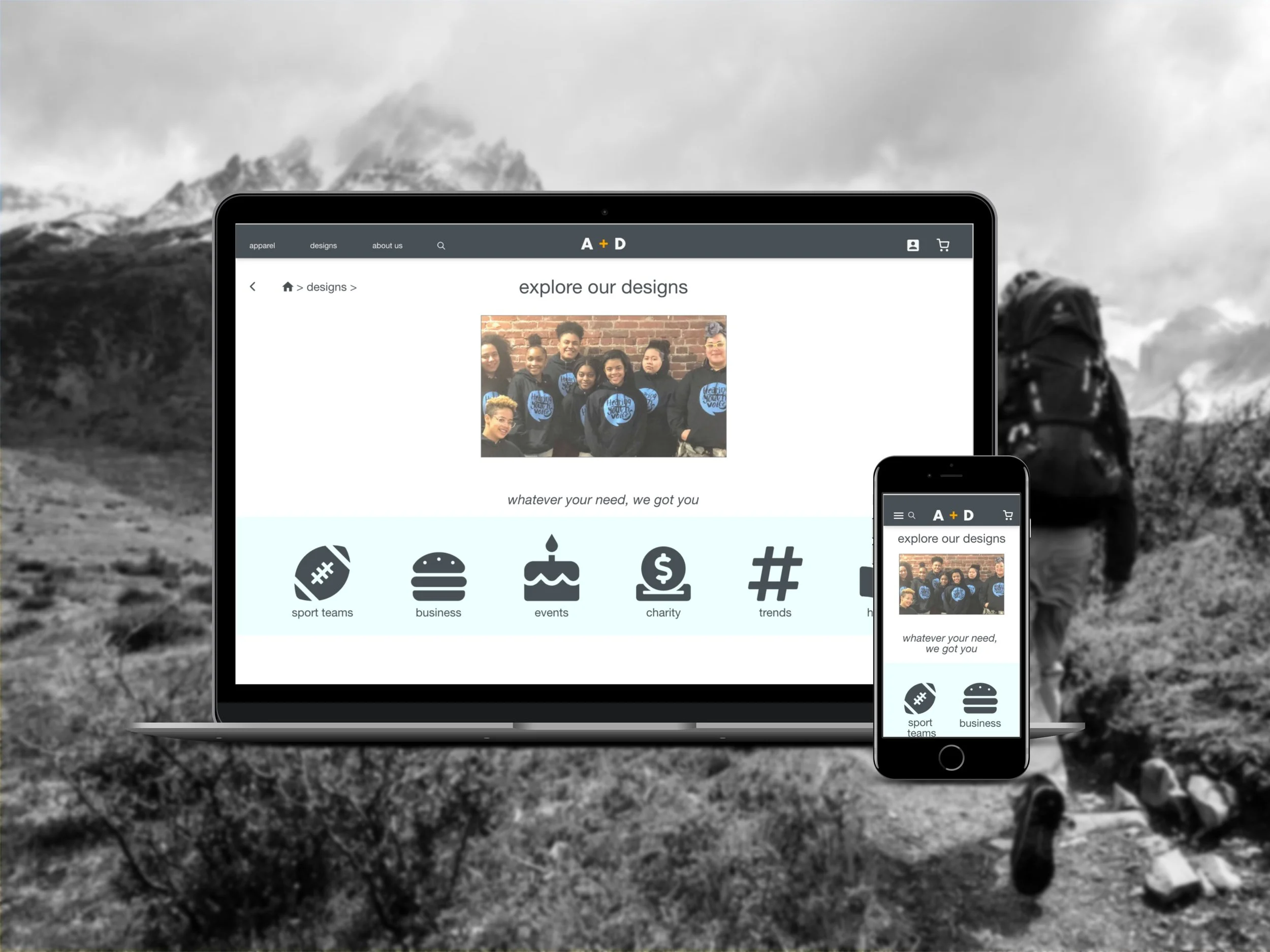
A + D, a responsive shopping website and app to order personalized sweatshirts
Overview
In the case study of the A + D responsive shopping website and mobile app, I had the opportunity to lead as the UX designer for a personalized sweatshirt ordering flow.
Throughout the project, my responsibilities encompassed the entire design process, from conception to delivery. This involved conducting primary and secondary research, performing a competitive audit, conducting interviews, creating paper and digital wireframes, developing low and high-fidelity prototypes, conducting usability studies, ensuring accessibility considerations, and continuously iterating on the design.
Problem Statement
In today's diverse landscape, numerous groups, including sports teams, businesses, special event participants, charity fundraisers, and individuals, require customized sweatshirts featuring unique designs. The objective is to create an accessible and efficient platform where users can effortlessly browse, create, or select their preferred designs to be printed on their desired sweatshirts.
Goal: Develop an online shopping platform that enables users to personalize sweatshirts with their own designs effortlessly, whether by downloading, creating, or selecting them.
Users and Audience
To gain insights into the needs of the users I was designing for, I conducted interviews and created empathy maps. Additionally, I conducted a competitive audit to analyze the existing landscape.
Contrary to my initial assumption, the competitive landscape turned out to be larger than anticipated, with many websites offering similar services. However, users expressed frustration with the confusing nature of these websites, which often presented a wide range of products, such as customizable mugs or water bottles.
Through my research, I discovered that users prefer a streamlined experience with a focus on apparel options and a diverse range of design choices. They also value the convenience of free returns, as it alleviates concerns about sizing issues.
Outcomes and Results
(detailed design process below)
During the design process of the A + D responsive website, I quickly realized that my initial ideas were just the starting point.
Through conducting usability studies, I encountered numerous surprises and challenges that helped me recognize and confront my own biases. These studies played a crucial role in iterating on my designs and ensuring that the app truly met the needs of its users.
One notable quote from a user during a usability study captures the positive experience:
"This is so fun to use. I really feel like I'm in control of the customization process. Now I want to make sweatshirts for so many situations!"
This feedback reinforced the effectiveness of the design and confirmed that the website successfully provided an enjoyable and empowering user experience, allowing users to fully engage in the customization process and unleash their creativity.
My design process
-

Understanding the user
Paint Points
Persona
-

Starting the design
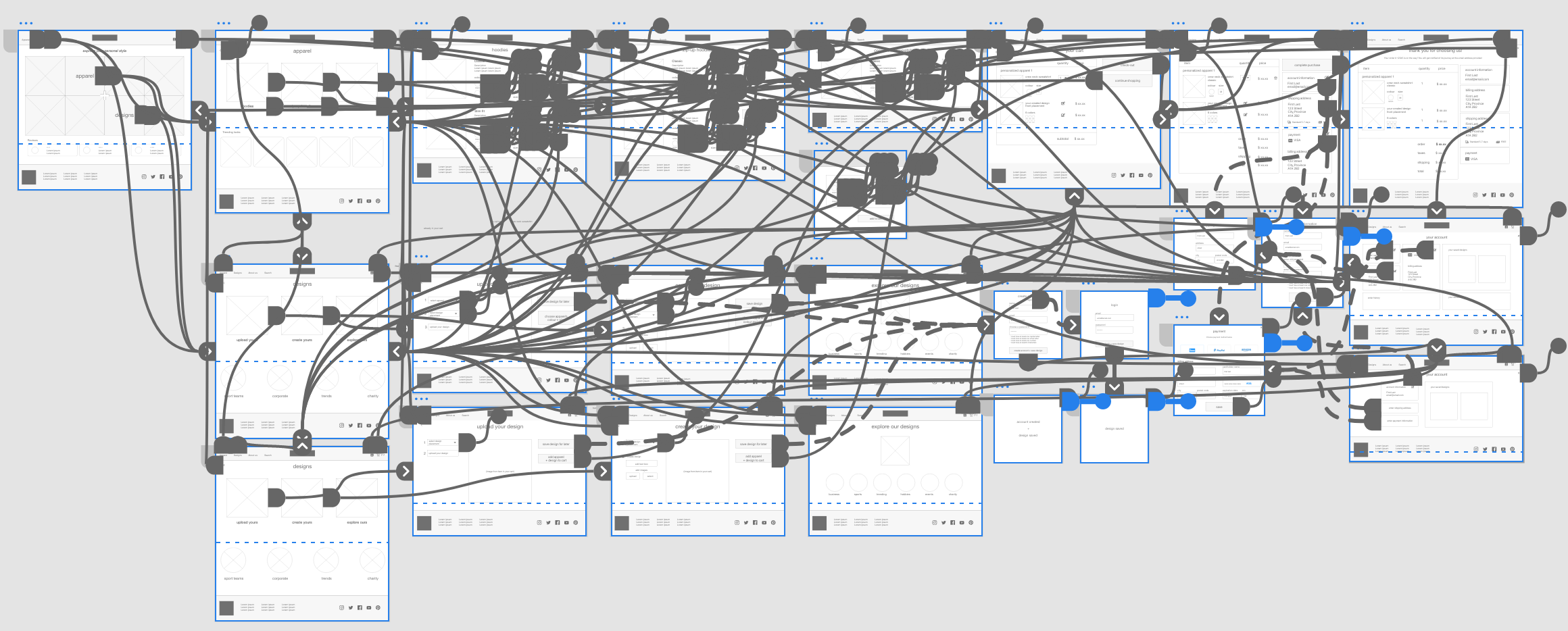
Sitemap
Paper Wireframes
Digital Wireframes
Low-Fidelity Prototype
Usability Study
-

Refining the design
Mockups
High-Fidelity Prototype
Understanding the user
Pain points
Key info is hard to find
Users often have a hard time finding where the shipping fees are indicated, or whether they have the option to download their logo.
Too many options
Users feel overwhelmed by the apparel options, such as fabric, colours, and styles. They are also frustrated trying to find what they want when other customizable items are offered.
Sizing
Users don’t feel confident they are ordering the right size for themselves because sizes vary depending on gender and across different companies.
Visual appeal
Users are underwhelmed by their shopping experience because the visual designs of the websites offering these services mostly look unsophisticated compared to fashion websites.
Creating a persona: Noa
Problem statement
Noa Lafayette is a young professional and avid hiker with many friends who needs a clear and streamlined website flow to buy personalized sweatshirts because they want to get their own logo design on hoodies for their hiking club members.
User journey map
Noa’s user journey illustrates how helpful a simple and clear flow to buy customizable sweatshirts would be to users.
Starting the design
Sitemap
My primary goal was to organize content as simply as possible. To do so, I used a hybrid of hierarchical and sequential structures: Users start with the top-level categories of choosing a design or apparel first and then refine their choices as they go through the flow, in a typical hierarchical model.
The sequential structure was optimal to lead users through the step-by-step process of combining the apparel with a design, and along the checkout process.
Paper wireframes
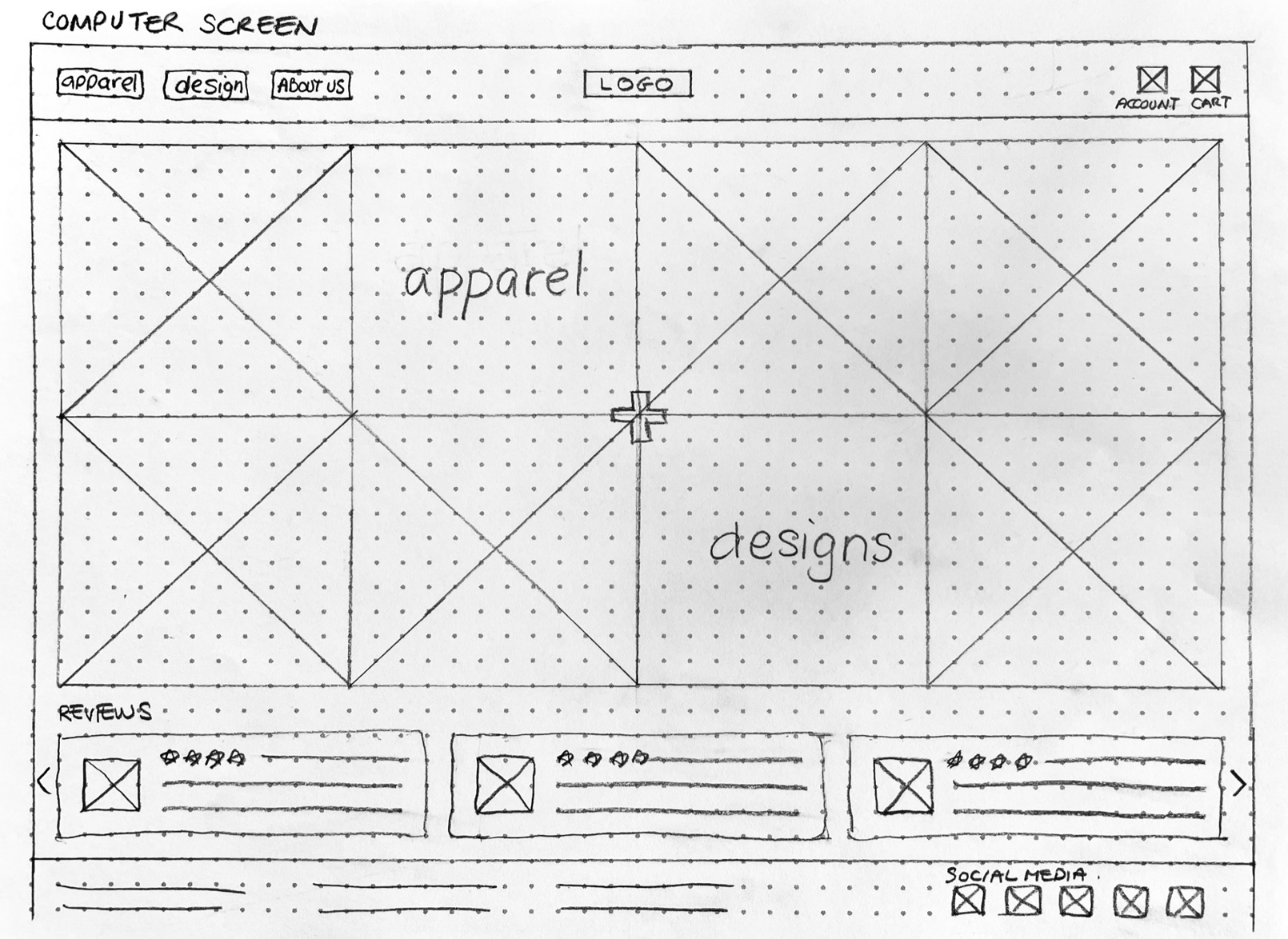
Drafting the iterations of each screen of the app on paper was an efficient way to explore options and finalize decisions about the elements and address user pain points to be included in the digital wireframes.
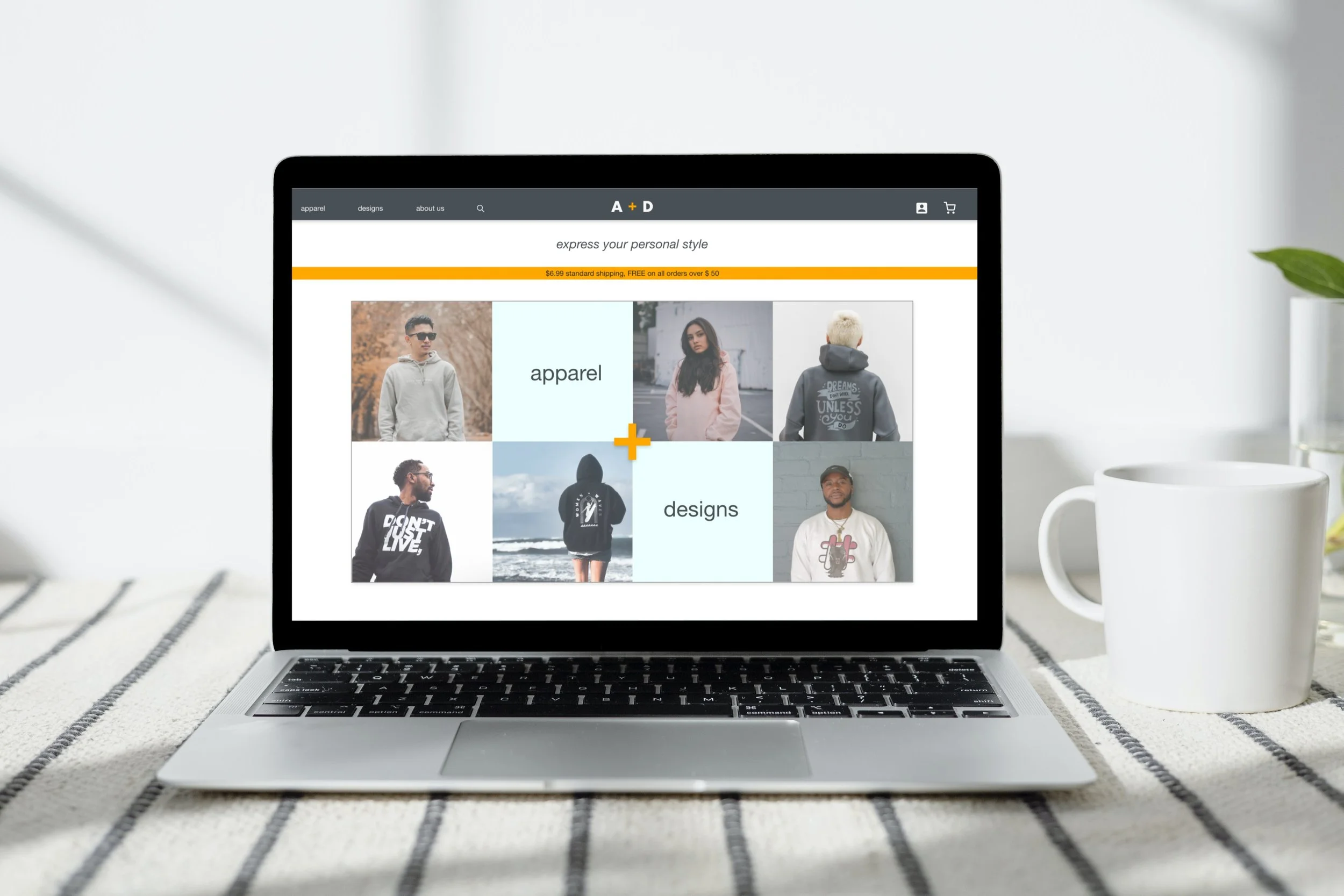
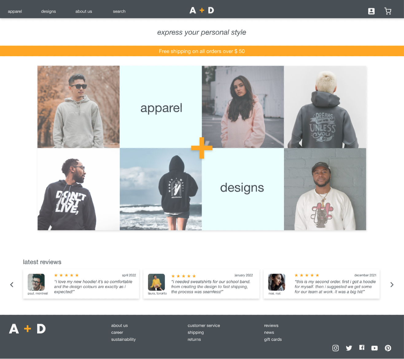
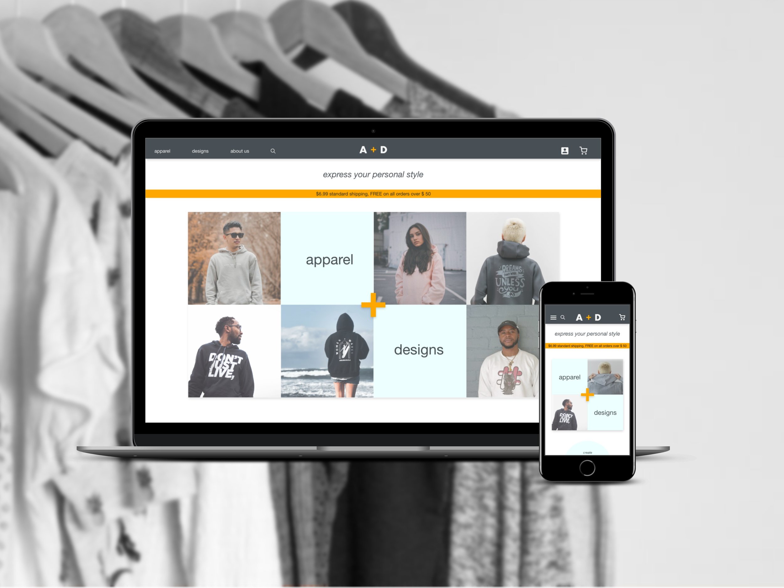
I wanted the visual and UI design to feel very simple with clean straight lines. For the home screen, a mosaic of photos allows users to quickly see multiple examples of the products while keeping an appealing look as seen in regular fashion clothing shopping sites. Reviews are also included, to reassure the user.
Paper wireframe screen size variations
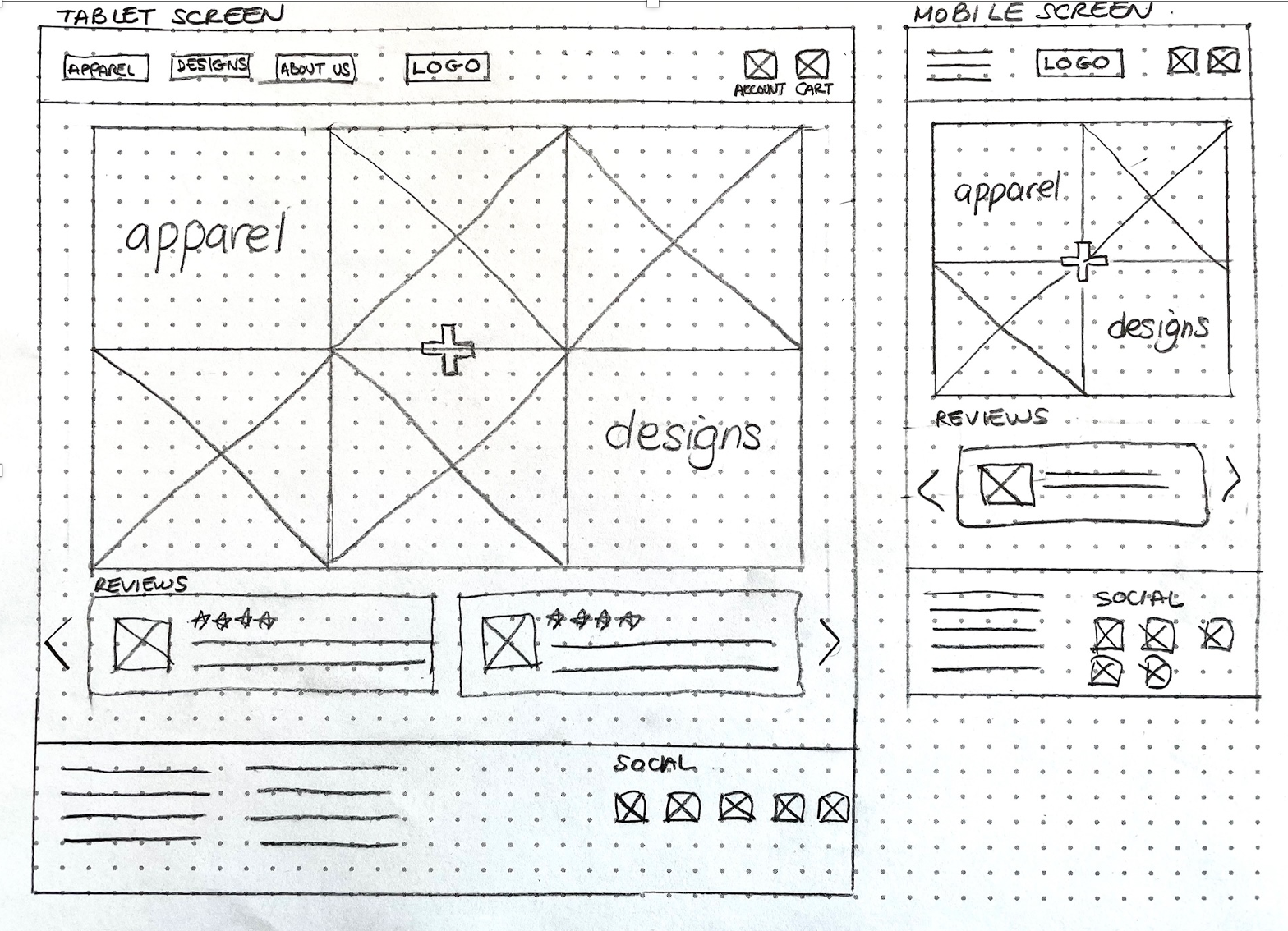
To plan for the responsive design, I had to consider how the elements on each page would respond to different screen sizes.
The mobile and tablet versions offered less space, so I had to slightly modify the mosaics on their respective homepages by removing photos, and create a different layout for the reviews.
I also had to group the top menu items of the website and tablet inside a hamburger menu for the mobile screen.
Digital wireframes
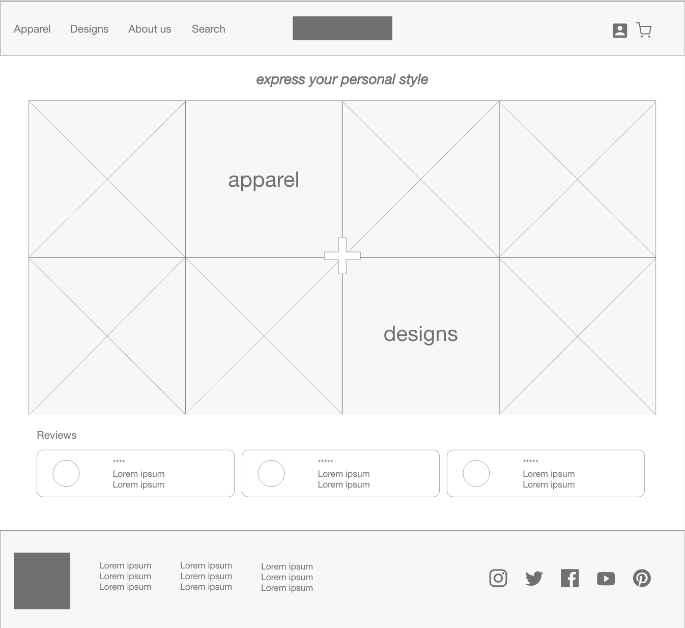
As the initial phase continued, I made sure to integrate user research insights into my screen designs.
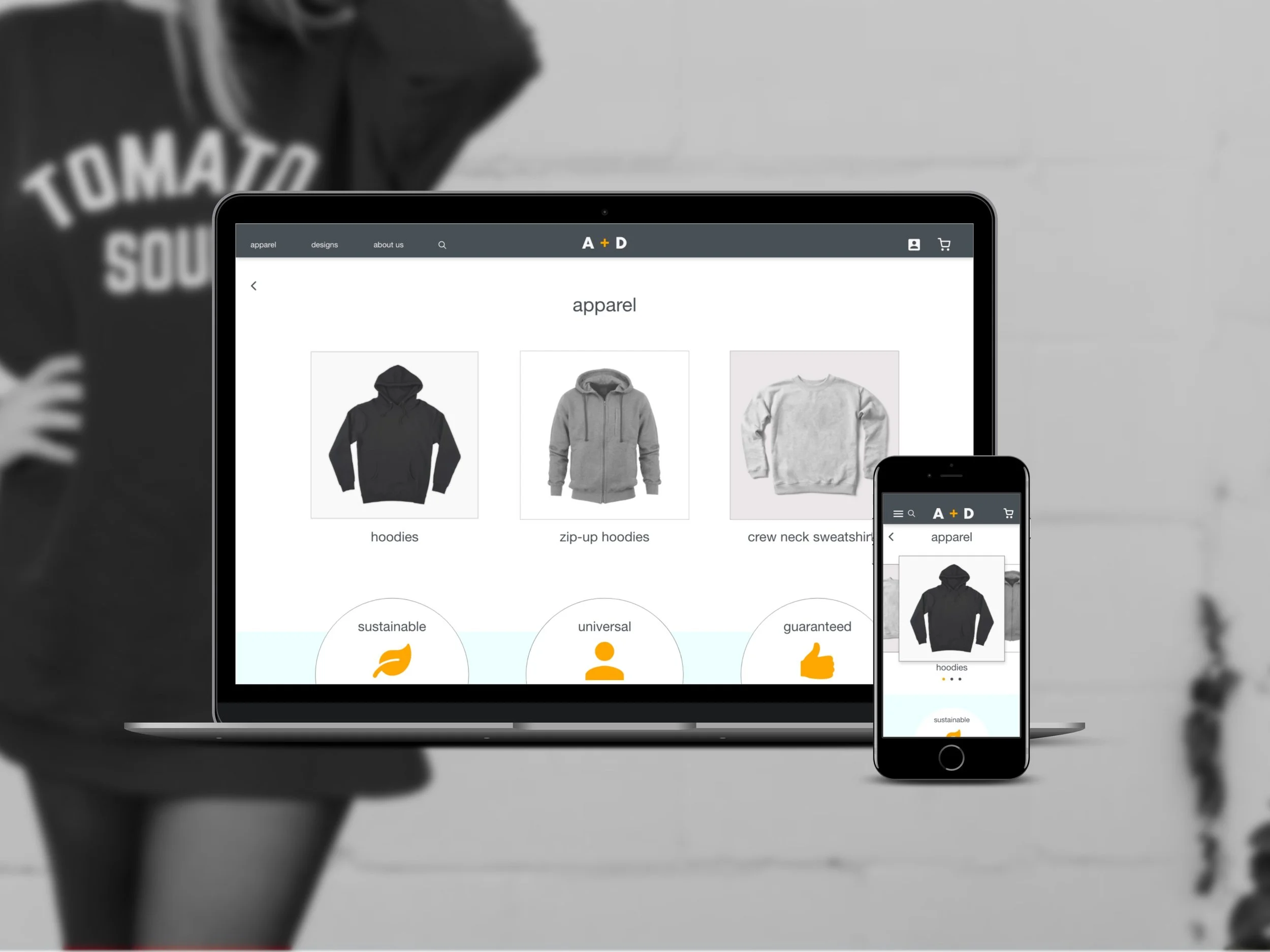
There are two main points of entry, “apparel” and “design”, to convey the flow is simple: combining two elements to create the customized product.
Positive reviews are included on the main page so users can be reassured about their purchases.
The visuals were mostly kept intact with the mobile version. I reduced the number of photos in the mosaic.
Low-fidelity prototype
The low-fidelity prototype connected the primary user flow of buying a customized apparel by adding a design to a sweatshirt and checking out so the prototype could be used in a usability study with users.
Usability study
-
Study type
Moderated usability study
-
Location
Montreal, in person
-
Participants
5 participants
-
Lenght
20-30 minutes
findings
The cart needs to clearly show that one item represents a combination of one sweatshirt with its chosen design.
Two distinct flows are needed for designs: one for adding them when the sweatshirt is already picked, and one to select them before the sweatshirt.
The buttons need to accurately indicate what they accomplish, such as “choose colour and size”, when the apparel is already selected.
Refining the design
Mockups
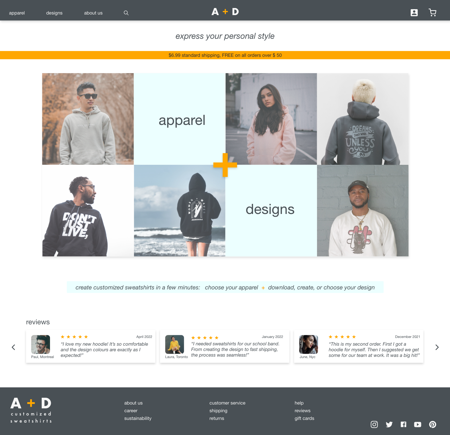
On the homepage, I added the shipping costs to the banner. I also added another banner to clarify that the website allows users to customize sweatshirts and that they have the option to upload their own designs.
Before usability study
After usability study
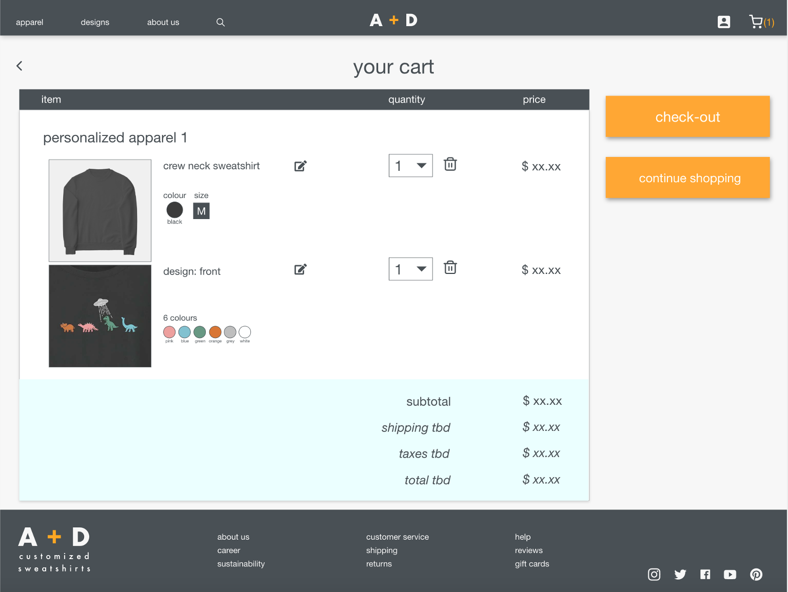
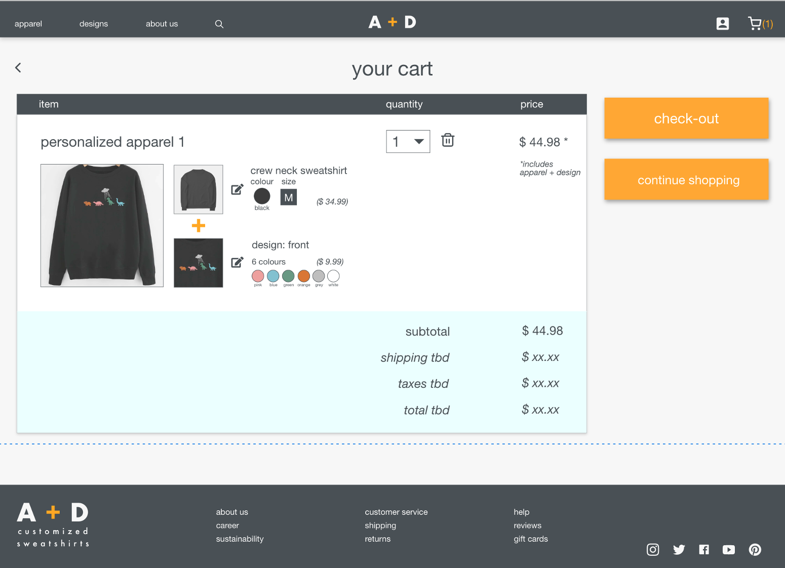
Since this shop doesn’t let users buy a sweatshirt without a design, the first cart page design was confusing: the number of items in the cart - a sweatshirt AND a design - did not match the number next to the cart icon.
Before usability study
I changed the cart layout to reflect that one item represents the combination of a sweatshirt and its design and the price is for both items combined. I also added a picture of the fila product so users know exactly what their product will look like.
After usability study
Mockups with screen size variations
High-fidelity prototypes
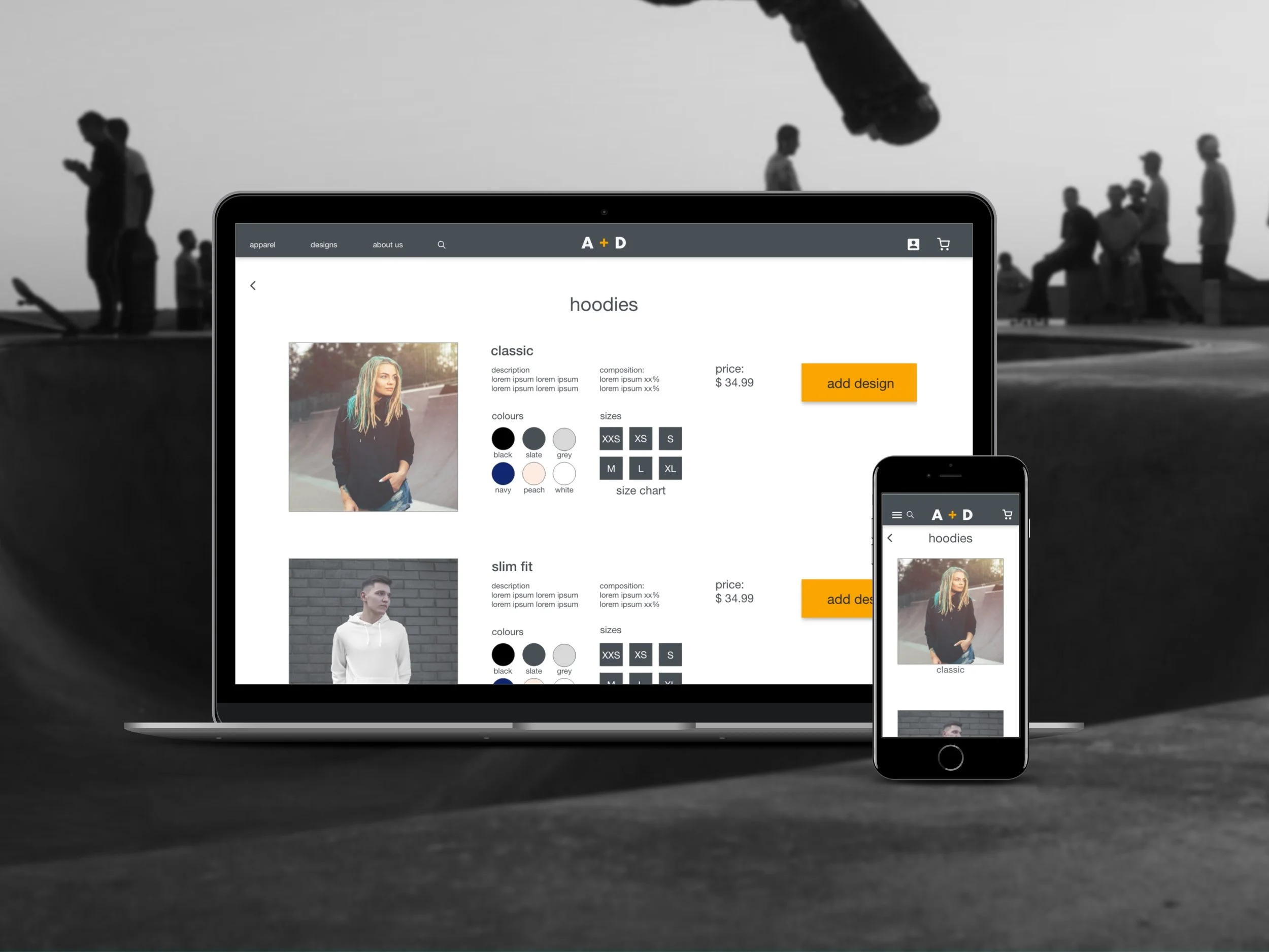
The final high-fidelity prototypes presented cleaner user flows for choosing hoodie, adding a design, and checking out. It also met users needs to easily navigate within the desktop and mobile versions of the website.
View the A + D desktop high-fidelity prototype
