
Redefining Empathable’s Website
Turning confusion into clarity and growth

At a Glance: Game Highlights
-

Role
Lead Product Strategist
•
Lead UX Copywriter
•
UX Design Co-LeadShaped project direction & voice, clarified messaging, co-designed site architecture, and translated founder feedback into actionable copy and design while advocating for scope and focus.
-
Challenge
Visitors couldn’t quickly answer:
What does empathy bring?
Who is it for?
How does it work?
Why Empathable?
Caused confusion about product value, limiting conversions. -

Approach
Led strategic discovery & built dual-audience vision boards, mapping problems → solutions → value propositions.
Clarified the two persuasion points: empathy upskilling drives ROI (buyers) and Empathable delivers it by meeting users’ needs.
Reframed messaging with outcome-first copy: user stories, metrics, testimonials; structured as problem → solution → proof → demo CTA.
Co-led UX redesign: modular layouts, narrative scroll paths, navigation, hierarchy, CTAs, and cohesive visual tone guided users toward conversion.
-

Impact
Redesigned a clear, credible, trust-building website that drives conversions across multiple audiences:
+79% organic traffic ↑
-51% bounce rate ↓
Stronger positioning & clearer messaging across healthcare, education, and enterprisee audiences.
Project Overview
Empathable is a B2B empathy training solution trusted by Cisco, Ford, and Harvard-affiliated institutions.
It helps teams lead better, collaborate smarter, and build stronger workplace culture. Delivered mostly through an app, it combines immersive, first-person videos with guided reflections, expert insights, and team discussions.
Empathable’s website is the company’s marketing engine—the first point of contact for potential clients.
I led a redesign that transformed it from fragmented and confusing into a clear, credible platform that communicates value, builds trust, and drives engagement.
My Role
Strategy & Discovery
UX Design
UX Copy
Product Strategist • Lead Copywriter • UX Co-Lead
Defined project scope and strategy by leading structured discovery, including client workshops and creating vision boards, aligning user needs with business goals across diverse audiences and industries.
Built trust, clarified value, and differentiated Empathable by crafting outcome-driven copy for multiple audiences and industries that simplified multi-steps empathy training content and embedded compelling proof points.
Co-led UX architecture, defining page contents, creating intuitive scroll paths, clear content hierarchy, and strategically placed CTA, reducing friction, enhancing clarity, to boost engagement and conversion.
The Challenge
The Goal
Empathable’s value and credibility were hidden by a confusing website experience, causing buyers to disengage and miss the product’s impact. This gap between product strength and web presence blocked growth, especially in new target sectors.
Redesign the site to clearly communicate value, build trust, and drive conversions, measured by reduced bounce, increased demo requests, and enhanced clarity for key audiences.
Pre-Game: Insights, Strategy, Scope
Discovery
Audit of the Original Site
Clarification of Client Goals
Audit of the Competitive Landscape
To tackle the challenge, we launched a structured discovery phase to explore the product, competitive landscape, and client priorities. Our goal was to identify gaps, surface opportunities, and build the foundation for a strategic redesign grounded in data-driven insights rather than assumptions.
First-time use revealed confusion, confirming gaps in hierarchy, messaging, and visuals.
Key issues included:
Buried value proposition and fragmented copy
Scattered or hard-to-find proof points, weakening credibility
Navigation and content hierarchy that made understanding difficult
Inconsistent visuals that diluted trust
The client’s brief was straightforward: redo the homepage, expand into healthcare as a growth area, and bring consistency to the visuals. He also asked for a redo of the industry pages, many of which had little content, so they could better speak to each audience.
Empathable delivers immersive, app-based empathy training with measurable outcomes—something few competitors can match. Virti (AI/VR simulations) and Enliven Empathy (VR DEI stories) offer related experiences, but the review confirmed Empathable’s unique niche. It highlighted strengths in engagement, scalability, and evidence-based design, while surfacing opportunities to sharpen value messaging for both users and organizations.
Example of Original Homepage Issues
The page lacked clear structure and hierarchy, making it hard for users to scan, understand, or follow a logical story. Visual and content elements didn’t guide attention, leaving the experience fragmented and the product’s value obscured.
Disconnected CTAs
CTAs lack context and guidance, leaving users unsure how to act and breaking the conversion flow.
Ambiguous Hero Section
Users can’t quickly grasp the value proposition. The tagline is unclear: What’s learned? Why real-life experience matters? and the imagery doesn’t reinforce the product’s value.
Messaging & Visual Confusion
Users struggle to understand the offering; vague claims and an unexplained app visual leave them unsure whether Empathable is an app, a service, or both.
Ambiguous Proof Claims
Users can’t assess credibility; industry examples and buttons fail to show outcomes or relevance, leaving users asking what’s being proven and why it matters.

Product Strategy
Dual Audience Challenge
My Approach: Vision Boards
Outcome
Redesigning Empathable’s website required more than aesthetics: it had to persuade multiple audiences.
Building on insights from discovery, I led a product strategy phase to deepen understanding of the product and its users, clarify unique value propositions, and align the team on priorities.
I conducted additional research beyond the client’s initial data to ensure our strategy addressed real user and business needs.
Each industry had two audiences to persuade.
Buyers: Needed clear ROI and measurable impact.
End users (employees): Their engagement determined ROI, so addressing their needs was essential to convincing decision-makers.
Created dual-audience vision boards to:
Map problems & goals: Identify each audience’s top challenges.
Link problems to solutions: Define value points and competitive advantages.
Reveal unique value propositions: Show why buyers should invest and why users would engage.
Buyers’ goals: Improve patient satisfaction, staff retention, and clinical outcomes.
Staff realities: Heavy workloads, limited time, and gaps in empathy and communication skills.
Interdependence: Buyers’ goals depend on the training delivering real value for staff, improving skills and patient outcomes.
Product value: Practical, time-efficient empathy training that fits staff workflow and delivers measurable impact.
Design impact: Mapping these challenges clarifies which selling points to emphasize and provides a foundation for UX, messaging, and content that engages both audiences effectively.
Vision boards guided strategic decisions, informed scope, and reduced iteration in Phase 1.
Example: Healthcare Vision Boards Insights

Phase 1 Scope of Release
Homepage & Industry Pages
What We Do Page
Messaging
Proof
CTAs
Insights from discovery and vision boards revealed that fully addressing user needs required expanding Phase 1 beyond the initial brief, defining deliverables that guided content, design, and visuals for a coherent, persuasive experience.
Deliver immediate clarity and differentiation within 30 seconds, showing measurable impact and practical relevance.
Combine the original What We Do and What Makes Us Different pages into a single page that explains the product, value proposition, and competitive advantages, and includes a trial for the app.
Anchored in vision board insights: show ROI and outcomes for buyers, while demonstrating staff needs are met to build confidence in adoption.
Metrics, testimonials, and client logos to validate credibility.
Contextual prompts that move buyers from exploration to confident adoption decisions.
Game On: Translating Strategy into the Site
Content Strategy
& UX Writing
Key Responsibilities & Achievements:
I shaped Empathable’s messaging to make its multi-step empathy learning solution and nuanced value points clear, approachable, and actionable. The challenge was synthesizing a large volume of information into messaging that worked across multiple pages and audiences.
Synthesized content & strategy: Managed detailed, multi-layered information across the site, simplifying messaging about the product, its value, and measurable outcomes into modular, bite-sized sections that were clear and actionable.
Strategic dual-audience messaging: Balanced two layers of persuasion: empathy upskilling drives ROI for buyers, and Empathable delivers real value for end users.
Guided content journeys: Built a repeatable narrative arc (success → problem → solution → proof → CTA) and adapted flow per page type: general pages (Homepage / What We Do) vs. industry-specific pages (Healthcare, Higher Ed, Enterprise).
Page-level adaptation: Tailored messaging, examples, and proof points—including industry-specific user stories—for each audience while keeping the global framework consistent.
Proof & credibility: Metrics, testimonials, and logos were applied across all scoped pages and adapted to audience context, reinforcing decision-making confidence.
Iterative collaboration: Worked closely with the founder and stakeholders to integrate feedback while maintaining coherent, focused messaging.
Outcome-Focused Homepage Copy
Improved on the original to highlight benefits for each industry and show users immediately what’s in it for them.
BEFORE

AFTER
Copy was vague and lacked outcomes or relevance, leaving users asking what’s being proven and why the examples mattered.
Copy now speaks directly to users with outcome-focused headlines, measurable-impact subheads, industry-specific benefit bullets, and CTAs that guide users to explore how Empathable solves their challenges.
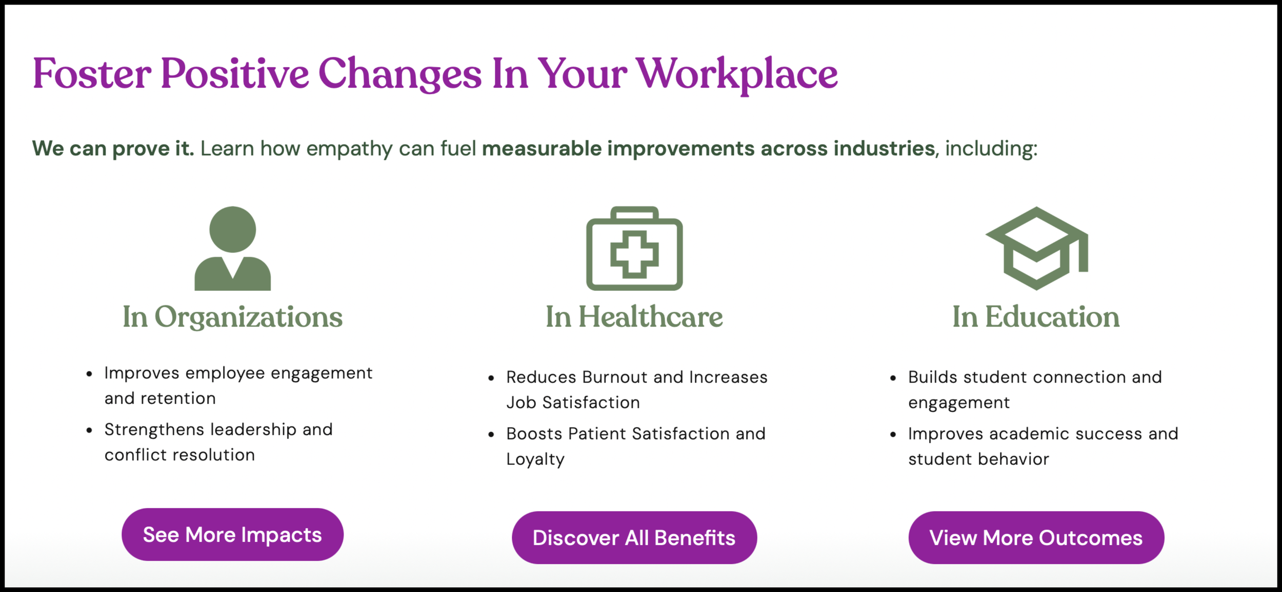
Persuasive Proof and Metrics Copy
Rather than simply asserting product value, we introduced new metrics sections to the What We Do and industry pages to establish credibility and persuade leaders. This example is from the Organization page.
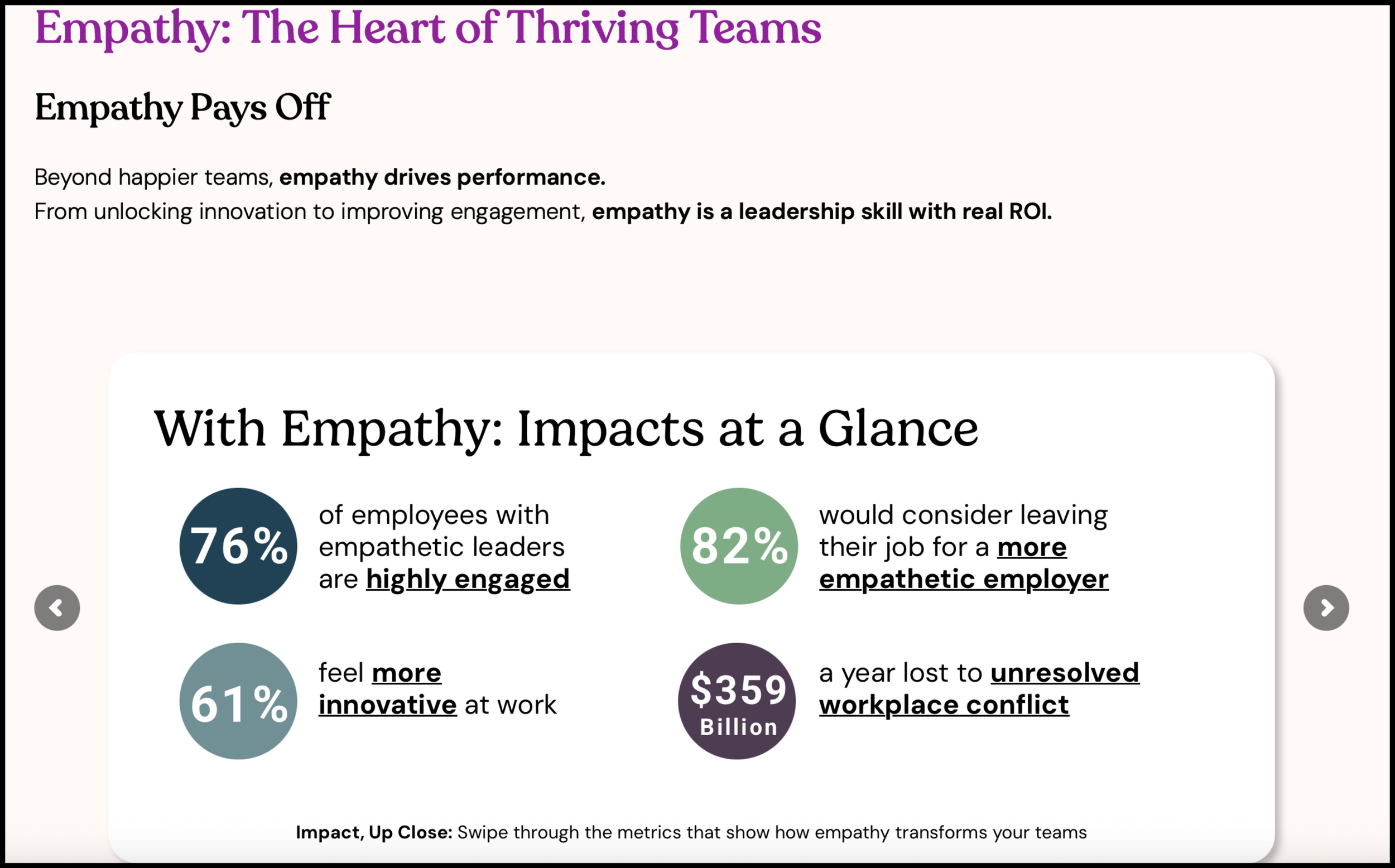
Metrics-driven copy with research-backed, industry-specific proof points. Punchy headlines and curated stats clearly show outcomes and establish credibility, guiding leaders to quickly understand empathy’s measurable impact on their organizations.
UX/UI design & Visual Alignment
Key Responsibilities & Achievements:
Building on the messaging, I co-led the visual strategy to create a user-centered site where information was clear, navigation was intuitive, and key outcomes and proof points stood out. The redesign guided diverse audiences through the homepage, What We Do, and industry pages, helping visitors quickly understand the product, trust its value, and take action.
Multi-audience strategy
Designed layouts to guide buyers and end users across industries, balancing multiple goals across scoped pages.
Content-driven hierarchy
Reinforced the content narrative arc and prioritized key outcomes and proof points for quick comprehension.
Intuitive flow & navigation
Structured pages for easy scanning and seamless action paths.
Unified visual language
Standardized typography, color, icons, and illustrations; recommended real human photos to preserve authenticity and empathy.
Accessibility & performance
Delivered responsive, fast-loading, WCAG-compliant pages; implemented in WordPress and QA-tested for diverse users.
Before & After: Page Transformations
-
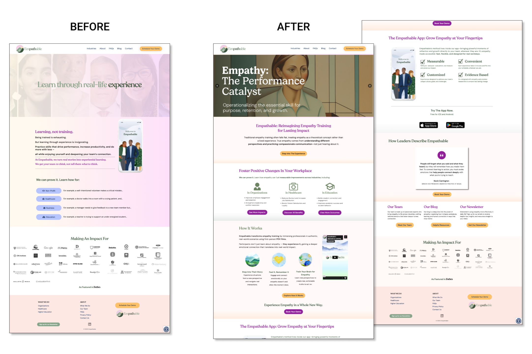
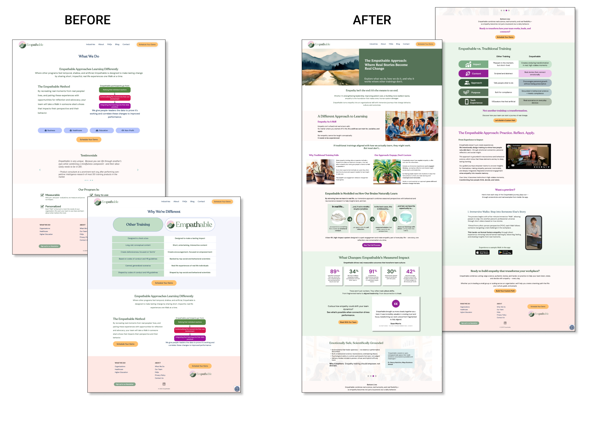
![Comparison of webpage designs labeled 'Before' and 'After,' showing a change in layout, style, and content for a website called Empathable, promoting empathy training.]()
Homepage
Before → After:
• Clear, bold headline and outcome-focused copy
• Narrative scroll path guides visitors through problem → solution → proof → CTAs
• Repeated, prominent CTAs.UX Rationale:
• Leads with a strong success/vision statement to immediately communicate Empathable’s unique value.
• Frames the problem with high-level context (why traditional empathy training falls short).
• Introduces solution via immersive, evidence-based approach.
• Integrates proof (metrics, testimonials, logos) to reinforce credibility.
• Guides multiple audiences (buyers & staff) through a frictionless content journey, prompting quick comprehension and action.Impact:
• Visitors understand Empathable’s value within 30 seconds.
• Clear, modular flow drives engagement with CTAs and increases demo or trial sign-ups.
• Establishes trust and positions Empathable as the modern, research-backed solution. -
![Comparison of a webpage layout before and after redesign, showing changes in layout, color scheme, and content arrangement for an empathetic training program.]()
What We Do
What We Do Page
Before → After:
Consolidated two pages into a single, modular layout explaining:
• product
• value proposition
• competitive advantages
• trial CTAUX Rationale:
• Highlights Empathable’s multi-step training approach with modular, bite-sized content.
• Frames empathy as a foundational skill and differentiates training via neuroscience-backed methods.
• Showcases proof: measurable outcomes, leadership testimonials, and comparative insights versus traditional training.
• Tailors relevance for multiple industries while keeping messaging clear and approachable.Impact:
• Users quickly grasp the multi-step training and its real-world benefits.
• Boosts confidence in adoption and engagement with trial/demo CTAs. -
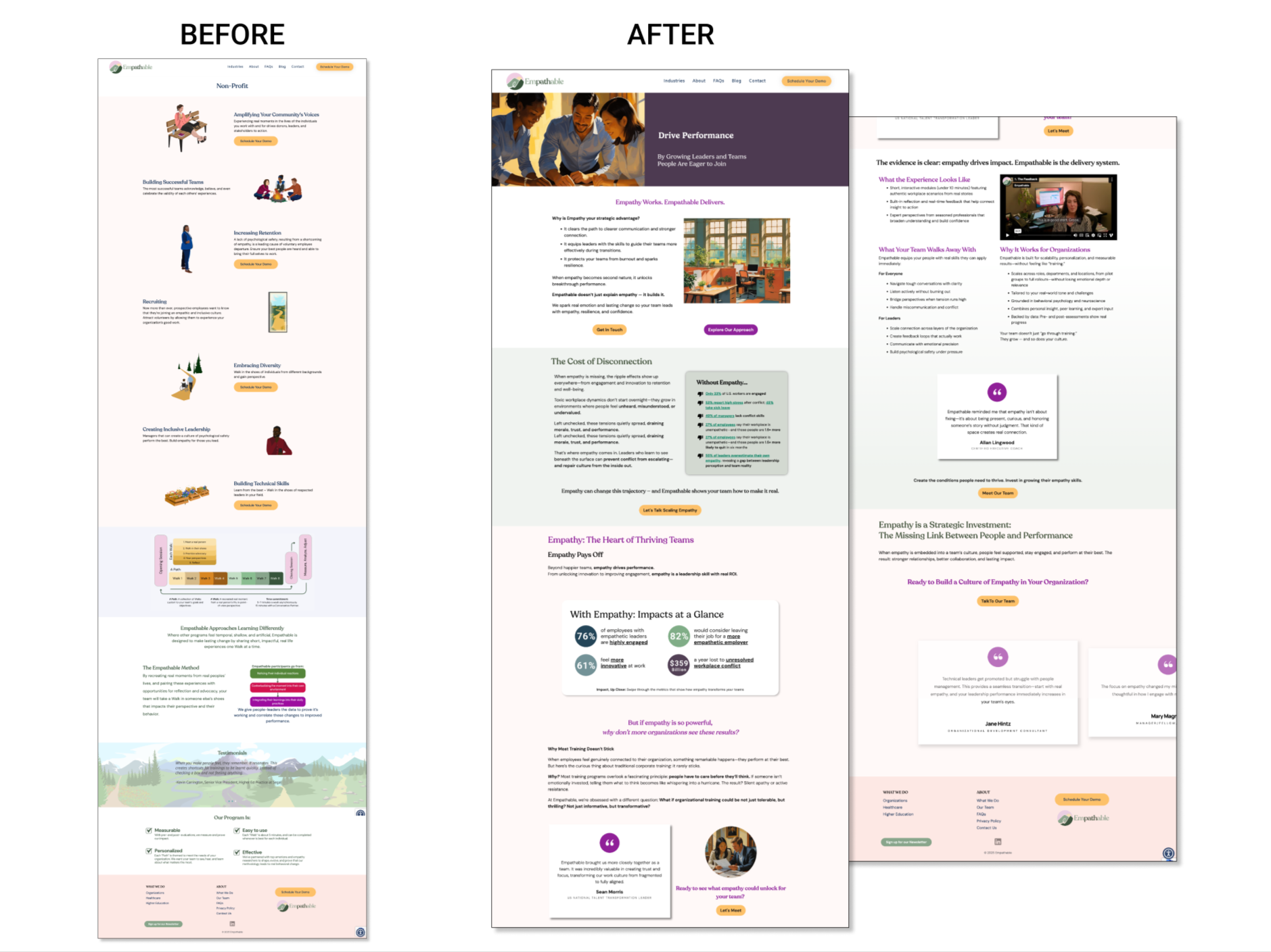
![Comparison of a website before and after redesign, showcasing layout and content improvements for the organization Empathable.]()
Organizations
Before → After:
• Consolidated content into a modular, outcome-focused layout showing how Empathable drives high-performing teams through empathy.
• Included leadership testimonials, industry-specific proof, and clear CTAs to guide decision-makers.UX Rationale:
• Frames empathy as a strategic advantage for organizational performance.
• Highlights key problems (disconnection, burnout, low engagement) and positions Empathable as the solution.
• Uses data, testimonials, and tangible outcomes to make the benefits clear and actionable for both leaders and teams.
• Modular layout and structured flow reduce cognitive load, letting users absorb insights quickly and move confidently toward action.Impact:
• Decision-makers immediately see the ROI and understand how empathy training improves performance, engagement, and culture.
• Clear proof points and CTAs drive adoption, demos, and trials.
Post-Game: Results and Takeaways
Outcomes & Impact
Transformed a fragmented site into a cohesive, trust-building platform that guided users to key actions.
Positioned Empathable as a credible, performance-enhancing solution across multiple audiences and industry sectors.
Reinforced differentiation through outcome-focused copy and strategic UX/UI design.
Established a foundation for ongoing testing, iteration, and scalable growth.
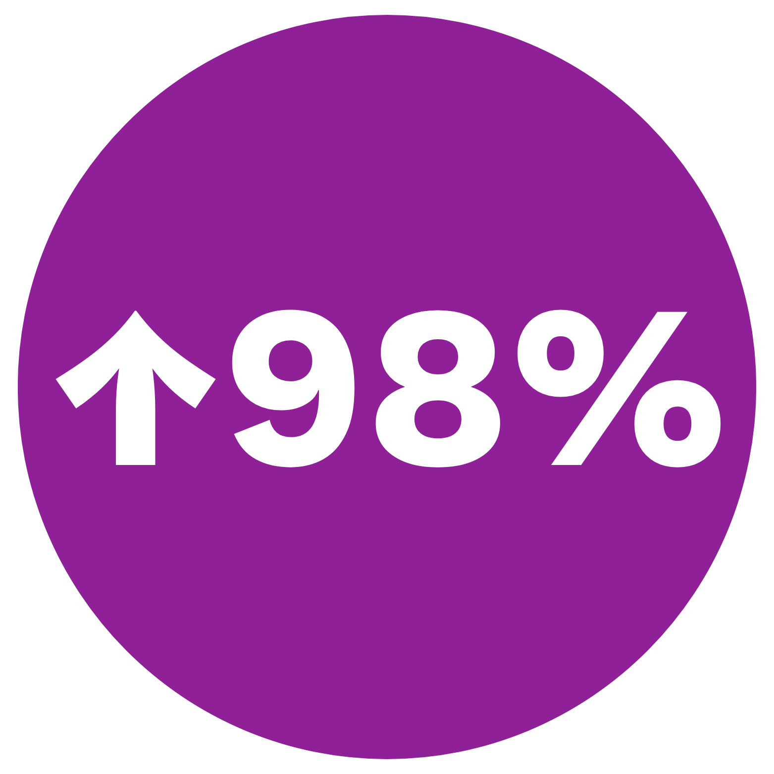
Key Metrics
-

Organic Traffic
More visitors reached the site post-redesign, demonstrating broader reach and impact
-
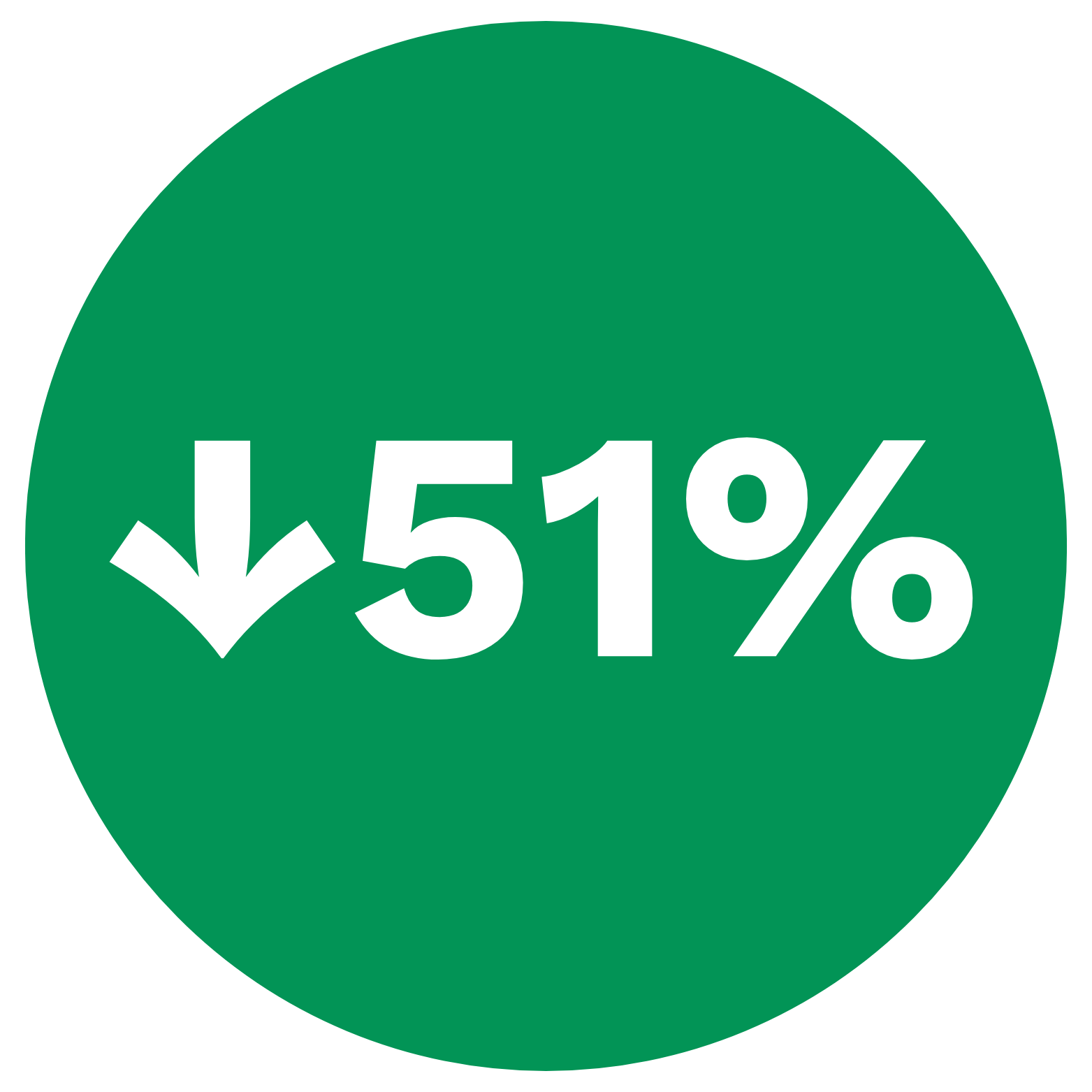
Bounce Rate
Down from 70%+, showing users stayed longer and engaged with the content
-
Site Accessibility
Up from 92%, making the site more inclusive and user-friendly
-

Best Practices
Up from 72%, reflecting improved UX quality and modern web standards
Final Score
The Empathable redesign proved that strategy, content, and design are inseparable: clarity builds trust, proof drives credibility, and thoughtful UX drives conversion.
We expanded the project scope to address user needs beyond the brief, turned complex empathy training into outcome-focused messaging, simplified content, embedded proof points, and managed multiple iterations.
The result: a coherent, enterprise-ready site that delights users, convinces buyers, and positions Empathable as the go-to solution for empathy training.
“As our UX designer, strategist and copywriter, Alyssa approached our website project with the kind of passion and dedication that’s rare to find. She didn’t just write copy—she crafted messaging that authentically captured our brand essence while speaking directly to our customers’ mindset. Our website is dramatically better because of Alyssa’s contributions. I wholeheartedly recommend her for any project where you need someone who infuses their work with both professional excellence and genuine care for the people who will experience it.”
Micah J. Kessel, CEO and Founder of Empathable

Next Match: User Research - Fall 2025
Testing With Users
Objectives
Method
KPIs
Building on the Phase 1 redesign, Phase 2 will focus on testing and validating the new experience with real users to ensure clarity, engagement, and conversion.
Validate clarity and appeal of messaging, navigation, and visual hierarchy
Test CTA effectiveness, demo conversion, and trust/resonance
Evaluate AI vs. authentic imagery impact
Moderated remote usability testing (Zoom/Google Meet) with 9–15 mid-to-senior professionals across healthcare, education, business, nonprofit, and government.
Value clarity, navigation success, demo interest, trust/resonance, content engagement, usability/accessibility barriers.